Anyone Can Map! Inspiration and an introduction to the world of mapping
Chef Gusteau was a visionary who created food experiences for the world to enjoy. How can we take his lessons and apply them to the world of mapping?
Taking inspiration from a culinary great
If you've seen the Pixar movie Ratatouille, you should know who Chef Gusteau is. He helped our "little chef" Remy the rat navigate the culinary world and become the top chef of Paris.

Throughout the movie, we get a lot of great quotes on their journey. But the one we're interested in here is Gusteau's motto, and the title of his book, "Anyone can cook!" So how can we apply this and the lessons to our own mapping journey?
I'll admit, part of the fun here was translating some of the lessons learned from one of my favorite movies, but there's a lot to take in here. I'm going to walk through some examples and types of maps that should get you motivated to get started with your own mapping application. So let's dive in!
Get inspired by learning about maps and the impact they have on the world
Food always comes to those who love to cook. – Chef Gusteau
Through my work, I've found it easy to fall in love with working on maps. Every day, scientists use maps to visualize data that can assist them in making more effective decisions. This directly translates to benefitting people all around the world and saving lives.
With this inspiration, you'll be taken on a journey to learn more about the different types of maps in this world and how they're being used. You even might stumble upon some interesting data that explores your own neighborhood!
Active fires around the world
Take for instance NASA's FIRMS service, which provides a realtime look at active fire data around the world.
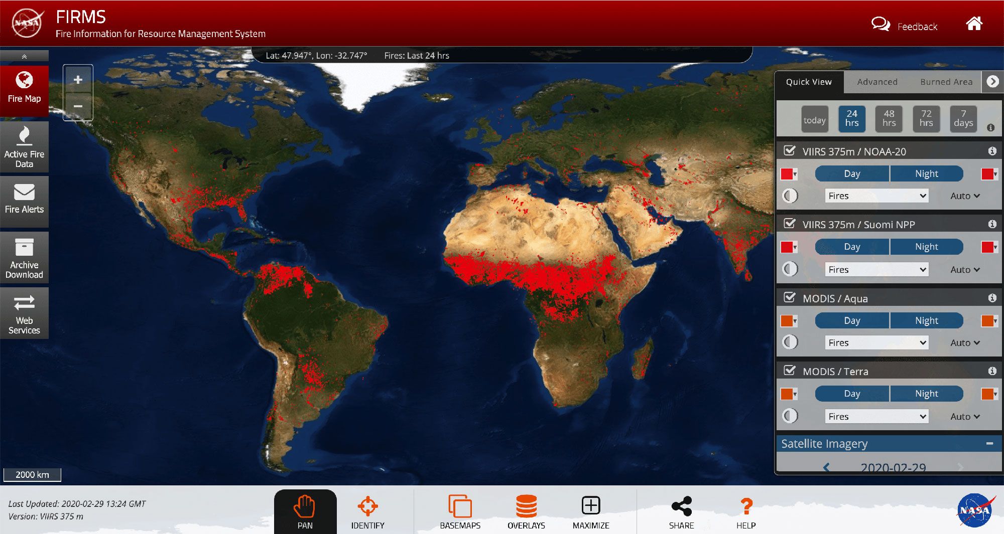
Active fires around the world via NASA FIRMS
Fires are a real-world example of disasters that we can learn from. This tool is used to help manage resources for stopping and preventing those fires by allowing scientists and those that are curious to analyze burn areas and model the data itself.
Global cases of COVID-19
And something very current, cases of COVID-19 (Coronavrius) around the world by Johns Hopkins Center for Systems Science and Engineering.
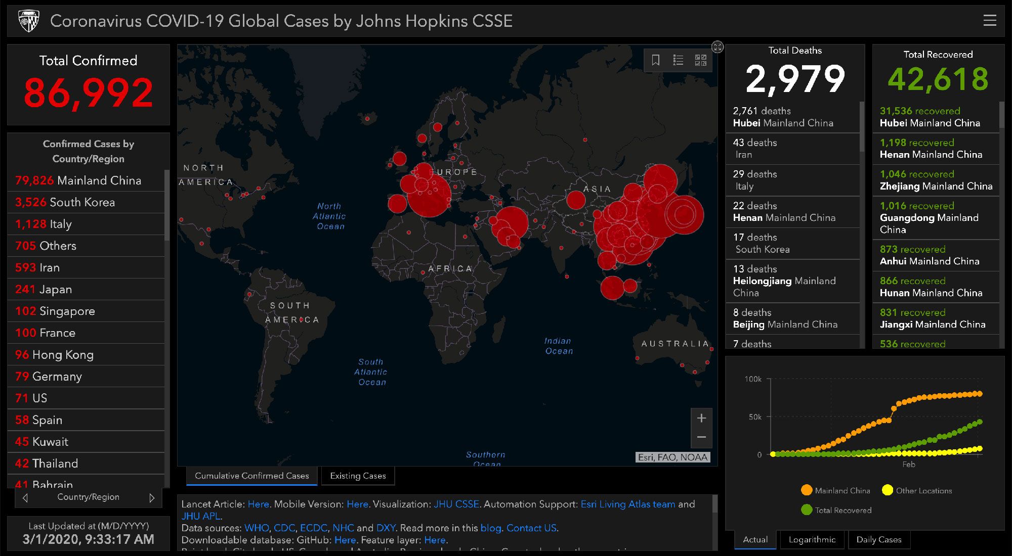
Global cases of Coronavirus (COVID-19) from John Hopkins CSSE
This map tracks the spread of the virus in real time, allowing scientists to model it's coverage and produce study results to share with the global community.
Mapping tools like this provide an effective means of giving as much information as possible in a way that's easy to understand to the people who can make a difference with the information.
Increased life expectancy
On a more positive note, we can get a detailed look over time of how life expectancy is improving around the world.
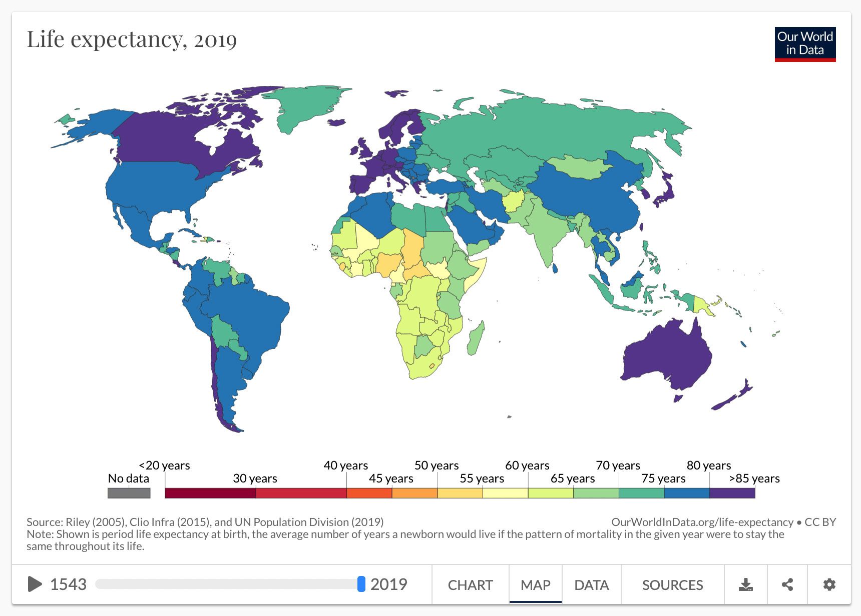
Life expectancy in 2019 from Our World in Data
While it's increased more in some areas than others, the global improvements are clear, and we get to see this rise in some countries from hundreds of years ago!
Explore the beauty of maps and applying data to them
How can I describe it? Good food is like music you can taste, color you can smell. There is excellence all around you. You need only to be aware to stop and savor it. – Chef Gusteau
There's also a creative side and beauty to great maps. Thick datasets applied to a map (or any medium) can often become literal works of art.
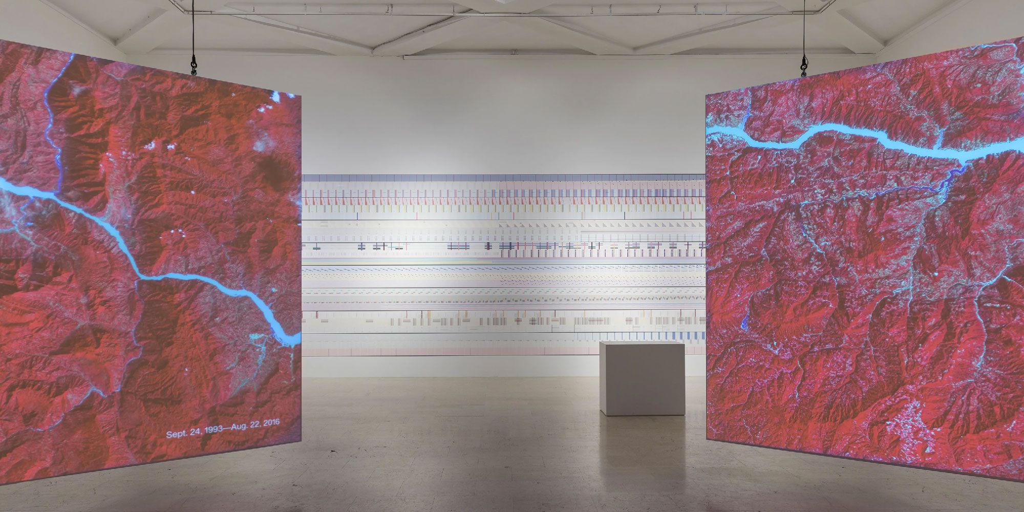
The Room of Change from Pentagram
Whether showcased in an exhibit or one of the many options to purchase on Etsy, presenting meaningful data in a beautiful way can be impactful not just from an informational perspective, but also a cultural one.
Sometimes the interactions can be fun
Maps can also provide some interactivity that makes them fun to explore while you learn more about the dataset, like this globe that maps out global commodities from DailyFX.
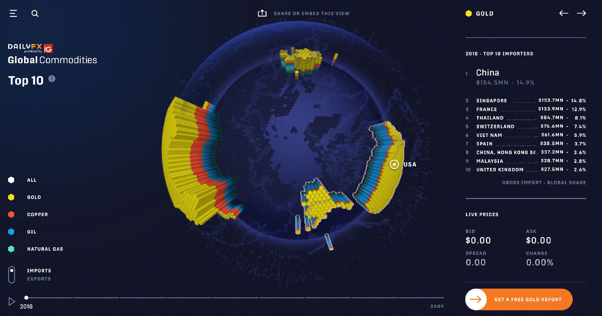
Global Commodities interactive map from DailyFX
Though the data can frequently be thick and boring on its own, that doesn't mean we can't find more interesting ways to present the data to interact with.
And sometimes maps can provide a listening experience
This map from at radiooooo.com allows you to travel around the world and through time.
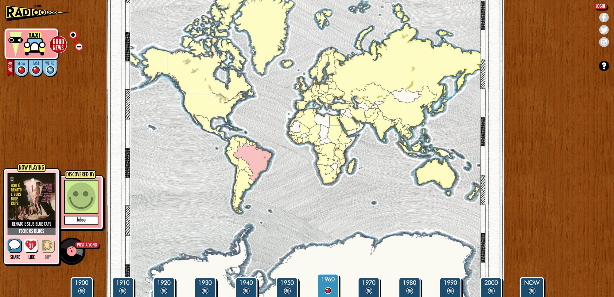
Music Radio from radiooooo.com
Their use of a map makes it easy to identify the part of the world the person wants to explore.
Stop and appreciate the maps around you
Whether you notice it or not when you're browsing the web every day, you most likely run into visualizations of datasets that create powerful ways to present that data in a way that's more easily understood.
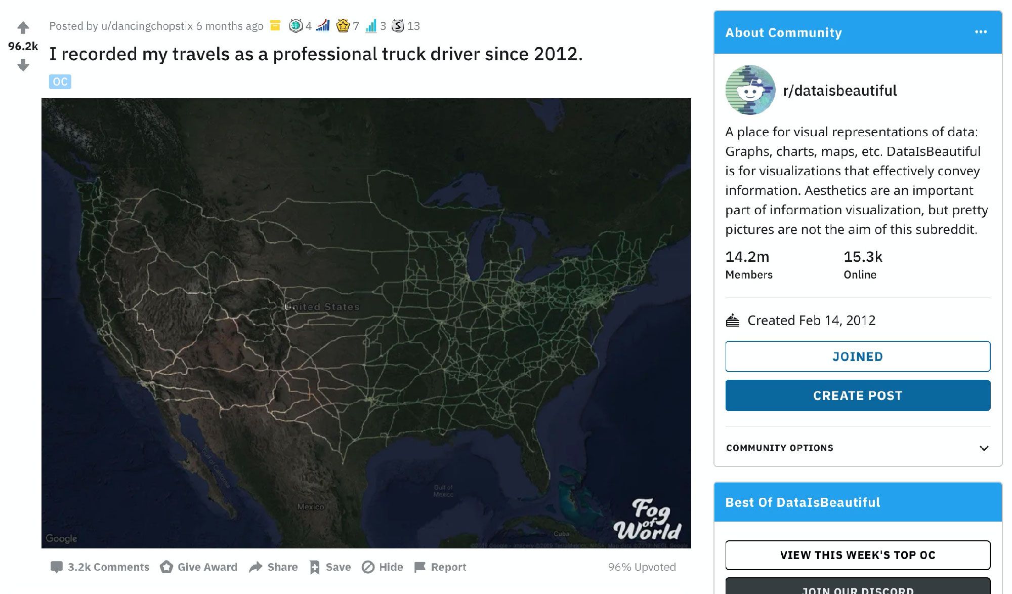
u/dancingchopstix's recordings of their truck driving travels
Luckily, we don't have to work hard to find this inspiration, as we can visit aggregations of beautiful maps and general datasets like that of /r/dataisbeautiful.
Experiment, be creative, explore other ways to visualize data
You must be imaginative, strong-hearted. You must try things that may not work, and you must not let anyone define your limits because of where you come from. Your only limit is your soul. – Chef Gusteau
Maps come in all shapes and sizes. While shaded geographic areas typically work well with election results, it might not work as well for showcasing your summer road trip.
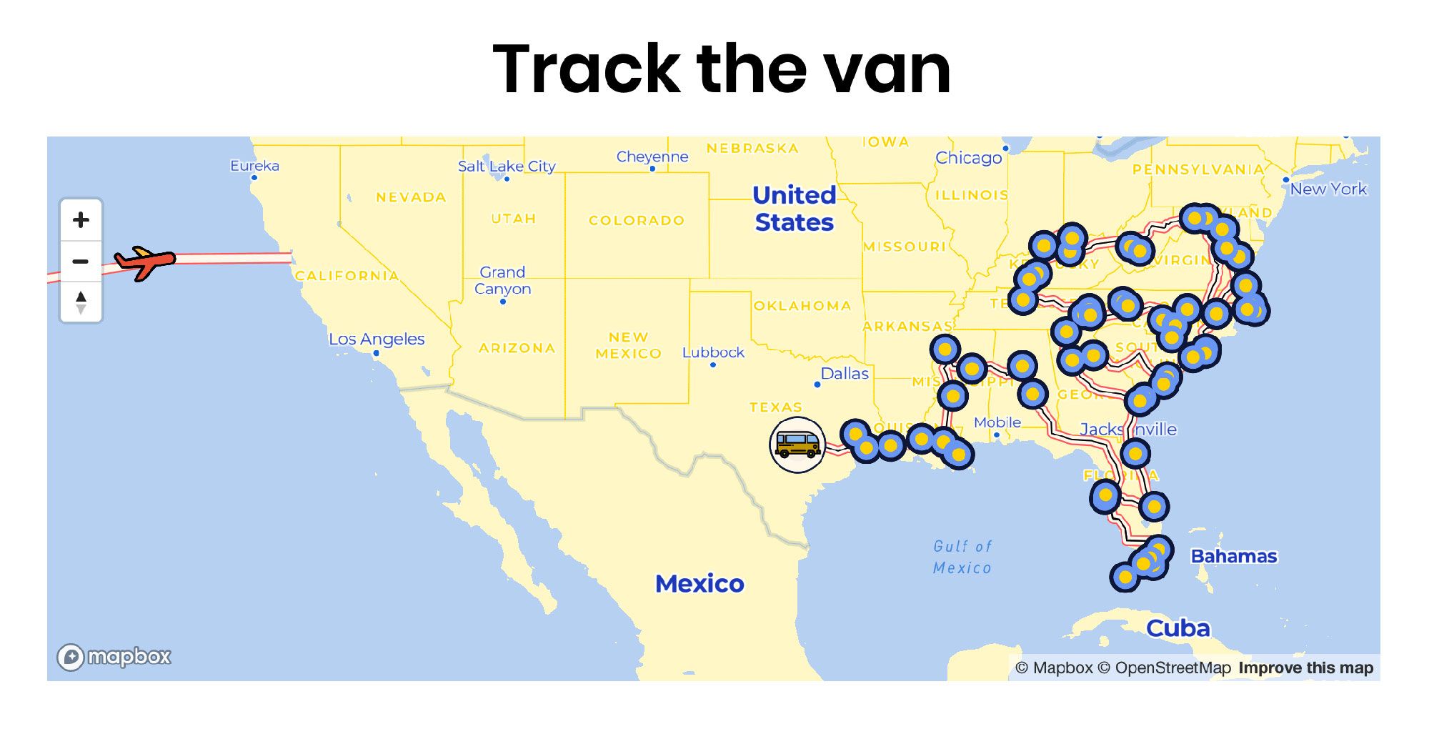
50 State Project road trip map
Exploring common map types
You've probably experienced more map types than you realize. Given it's a powerful way to present data, maps are used frequently across the web.
A choropleth map is commonly seen for election results and regional datasets where a particular geographic location represents a point of reference.
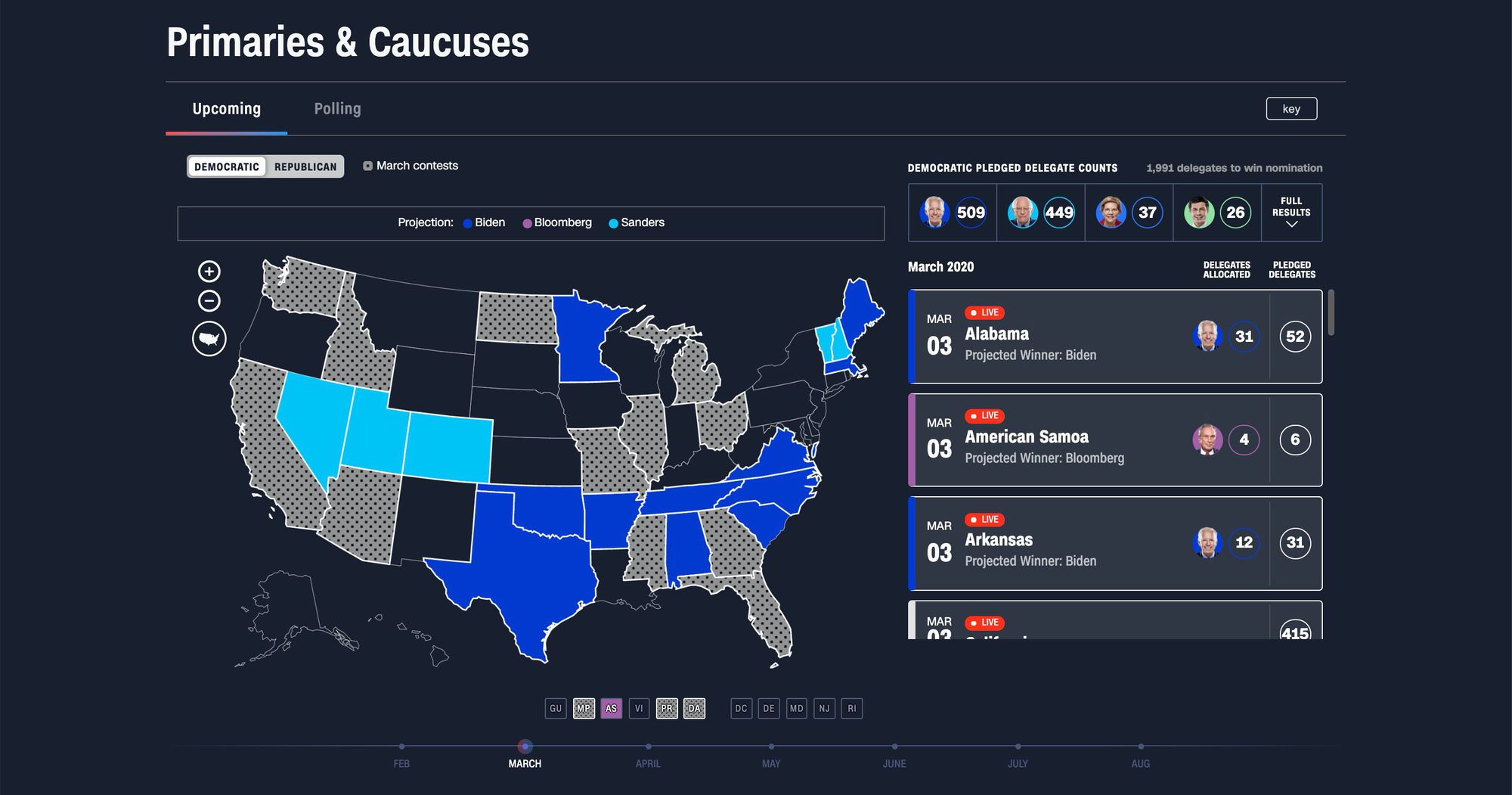
CNN Map of Democratic primary after Super Tuesday
Heat maps on the other hand allow you to reflect on the intensity of a data point over a given area. This is powerful when you want to represent both the area covered of a dataset but also range the data represents at the same time, such as population density.
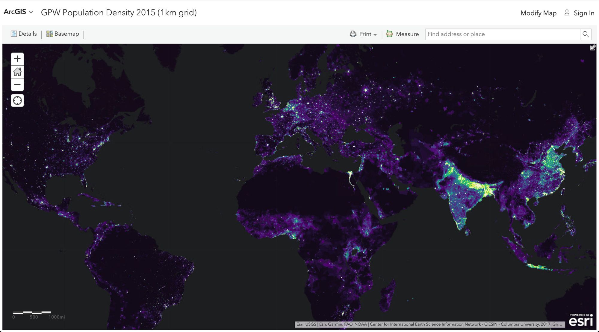
ArcGIS GPW 2015 Population Density heat map from
Learn from others, but don't be afraid to create a new path
Explore and play around with different techniques to visualize data on a map. There's frequently not one way to do it, meaning you can be creative and experiment with different ways of presenting your map.
But that also means you don't need to be stuck working within the constraints of the common map types. Use the tools available or create new ones and break new ground. The most important thing is presenting the data in a way that will provide the most impact to those consuming it.
Don't give up, learn from your experiences
What I say is true — anyone can cook… but only the fearless can be great. – Chef Gusteau
While there may not always be a right way, there sometimes are wrong ways. But don't let failure stop you!
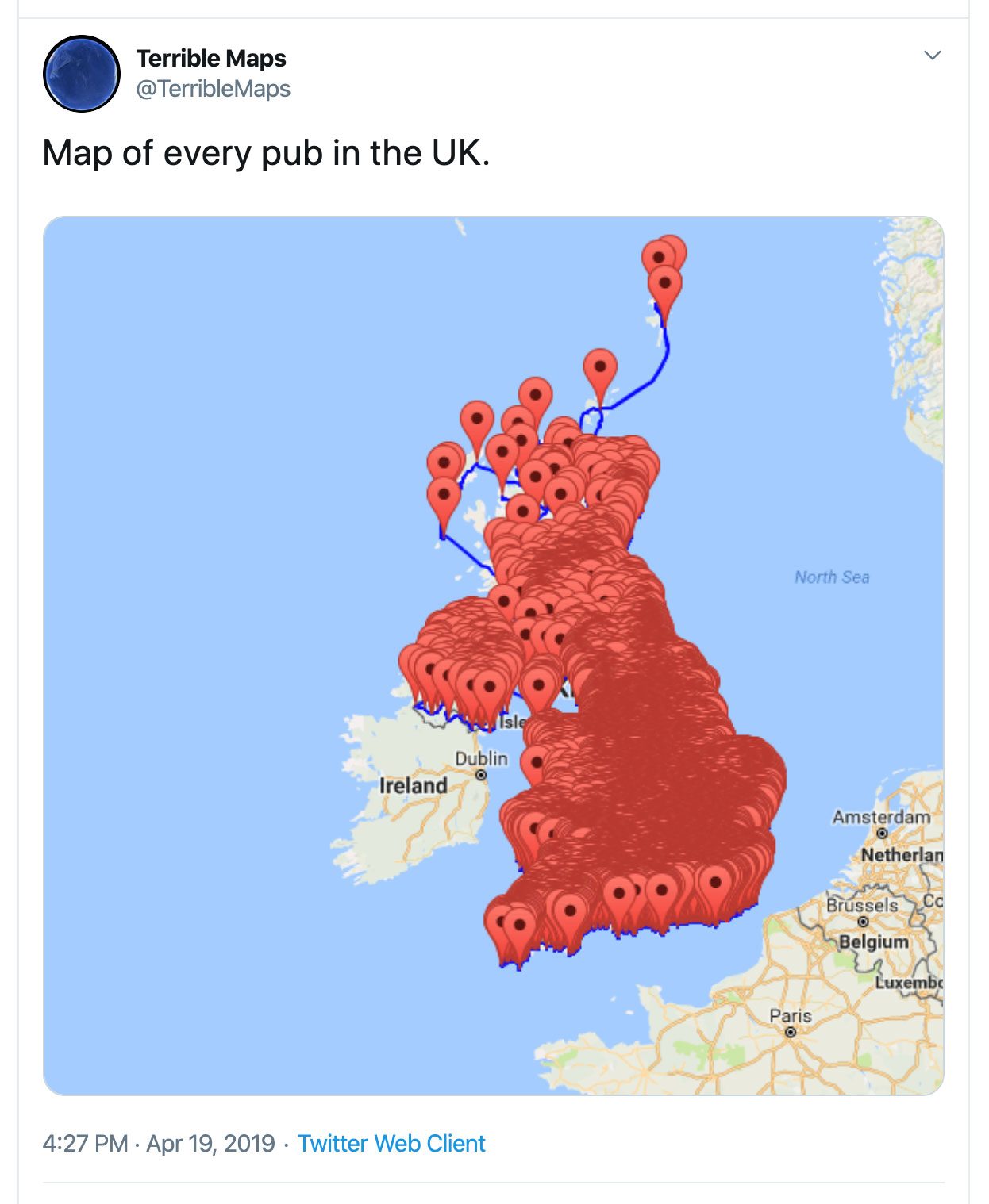
https://twitter.com/TerribleMaps/status/1119336763762331649
Take these failures as a learning experience in your journey of creating interesting and effective maps. By being bold with your experimentation, you'll find yourself discovering techniques or creating new ways that can ultimately help people better understand map data.
You don't have to be a cartographer to build great maps
Not everyone can become a great artist; but a great artist can come from anywhere. – Anton Ego
Towards the end of Remy's journey, the food critic Anton Ego who was once critical of Gusteau's claim that "anyone can cook" came to a realization of what our chef truly meant.

Ratatouille critic Anton Ego's revelation
While it's not reasonable to assume that every single one of us will be a great mapper, everyone has the opportunity to try and explore the medium.
And it certainly helps that we have plenty of tooling to help us get there. Whether building your own with Leaflet or identifying a few locations on a Google Map, the resources and community around mapping are endless.
Jump in with some resources to get started
For the developers out there who are inspired to get started, here are a few resources to start off with mapping:
- How to build a mapping app in React the easy way with Leaflet
- How to Visualize Air Pollution using Folium Maps – An In Depth Tutorial
- How to integrate maps in React Native using react-native-maps
- How to Create your own Santa Tracker with Gatsby and React Leaflet
- Building Maps with Impact on React and the JAMstack (Video)
- Gatsby Starter Leaflet
- Leaflet
- OpenLayers
- My Maps by Google